
Magazine front covers:
split covers
This is one of several pages on Magforum.com about magazine front covers. Here, split covers are covered, using the following examples:
- Neon: a promotional split cover (1996)
- Riva reveals contents page (1988)
- Australian Women's Weekly contents split (1998)
- BBC Good Food: split cover plus cut-out (2001)
- Nuts runs a fake, trompe l'oeil split cover
Neon: a promotional split cover (1996)
|
Neon was launched in 1996 with the most common type of split cover used to promote the big features with a competition on the reverse.
The yellow half cover wraps around as the outer back cover.
The full 'inner front' cover is either wrapped around on a stapled magazine, or glued in as an 'insert' for a perfect-bound title. The idea is expensive for several reasons.
First, the non-standard cover would cost more to set up for printing and binding. Second, the cover paper has to be used on page 3 or it would be likely to rip. Cover stock is thicker, so is more expensive.
Neon was saddle-stitched, so expensive cover stock also had to be used for the inner back cover (it is the same sheet of paper as page 3). |
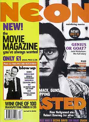 Neon used a half cover as a promotional tool for its launch – note that the two halves of the masthead do not line up |
Riva reveals contents page (1988) |
|
| Glossy weekly Riva launched in 1988 with the right-hand quarter of the front cover trimmed off to reveal a contents strip on page 3.
More about Riva, an expensive failure |
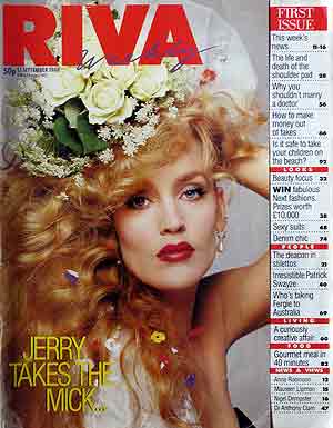 Riva cut off one quarter of the right side of the front cover to reveal the contents on page 3 |
Australian Women's Weekly cover split |
|
| The Australian Women's Weekly has some strange features. First off, it's a monthly! This cover (September 1998) would be unusual on UK news-stands. It pretty much relies on a full facing – you don't see much when the rule of the left third is applied. The cover is split with almost the right third removed to reveal part of the contents spread on pages 2 and 3.
In the case of the perfect-bound AWW, page 3 was a single page bound into the square spine, again extra cost, but with less use of cover stock than Riva. |
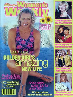 The Australian Women's Weekly cut off the right side of the cover for the page 3 contents |
BBC Good Food: split cover plus cut-out |
|
| The BBC's Good Food magazine went a step further for July 2001 with a split cover that was also a cut-out.
This is rarely done, not only because of the extra expense of the cut-out, but also because the edges of the cut-out tend to get bent over on the newsagents' shelves so copies can end up looking tacky. Note the white 'halo' around each chef's hair. The 'spread' that results when the 'half' cover is folded back is shown on the right. Behind the split cover is a promotion for BBC books. Note that the 'haloes' of white no longer match the chefs' heads Redwood/BBC Magazines used the Neon-style standard cover split for the launch of its third BBC title Top Gear, in October 1983. |
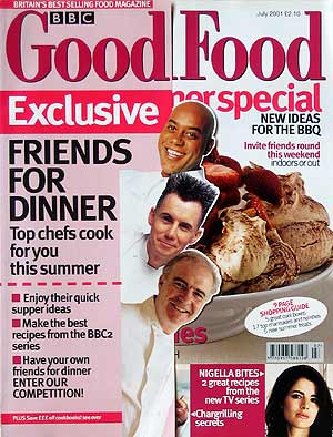 BBC Good Food split its cover and trimmed around the chefs' heads – note the 'haloes' 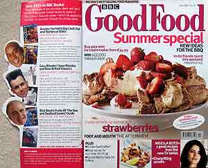 The 'half' cover folded back with the 'haloes' of white no longer matching the chefs' heads |
Nuts runs a fake split cover |
|
| Nuts, the IPC men's weekly, sought to get the advantages of a split cover without the cost (17 July 2009). It's done with clever shadow and making sure elements don't line up – just like the real thing! The art director was Simon Freeborough.
The diagonal split is an example of trompe l'oeil – you have to touch it just to make sure it's not real. |
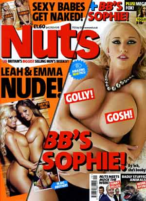 Nuts – a fake diagonal split cover |