The season of relaunches
For Keats, in his Ode to Autumn, it is the 'Season of mists and
mellow fruitfulness.' For publishers, autumn is a time of revamps, redesigns
and relaunches as magazines enter the big season for sales and advertising.
| 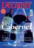
Decanter redesign
‘fresher, cleaner and modern feel’
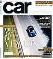
Car relaunch: a
change to a square format, new editorial features and listings moved
to the website
|
|
October 2006 relaunches
IPC in particular has been dusting its titles off, with examples
including:
- Decanter (November issue on sale October 4): IPC Media’s
title is after a ‘fresher, cleaner and modern feel’
as well as introducing new writers
- TV and Satellite Week (on sale 3 October): again,
IPC wants to be ‘modern and bright’ and easier to
use; it also introduces a dedicated football TV guide
- Ideal Home (on sale 3 October) claims to be the UK’s
biggest-selling home interest title, so in a position of strength.
Its strategy is: ‘a greater use of photography within the
magazine and the design and layout are clearer and more modern,
satisfying the readers’ preference to “view”
the magazine’. This also takes place as Family Circle
puts out its final issue, so IPC will want to capture those buyers
and readers
- Marie Claire took a big hit in the recent ABC sales
results so IPC has gone back to the title’s core strengths
of fashion, beauty, real-life, celebrity and advice. The main
feature in terms of content from the relaunch is the tripling
in in the number of pages devoted to ‘high fashion’,
with the section now called ‘The Shops’. It includes
a regular celebrity interview by Janet Street Porter.
Emap has also been on a relaunching spree. It, like IPC, has a central team analysing
sales and cultural trends and working on strategies to exploit or
minimise their effects. As so many young readers turn to cheaper
weeklies and web sources, it wants its monthlies to have
more depth and 'luxury'.
- Q has dropped its CD covermounts and wants to become
a more "luxurious" monthly music read. This is a similar
strategy to the recent Car relaunch.
Editor Paul Rees wants to focus on usefulness, entertainment and
quality – a mantra that sounds like a reworking of FHM’s
‘funny, sexy, useful’ from 1997.
- FHM: Its revamp goes back to July,
and has been summed up by Press
Gazette as: ‘inspirational, aspirational and intelligent’.
Although it is still the sector leader, FHM’s sales
have been in freefall since the arrival of the weeklies, Zoo
and Nuts. It has lost its younger readers so has decided
to concentrate on increasing its share of the falling monthly
market – in other words squeezing out weaker competitors
such as Front and Maxim. Editor Ross Brown said:
‘My job is to ensure that our existing readers come back
more often and stay longer.’
So what is the difference between a revamp, a redesign and a relaunch?
And why do publishers do it?
Back
to top
|
| |
|
Revamp, redesign or relaunch?
For a start, the terms are used pretty indiscriminately by publishers
and quite what each entails depends on who is doing the re-thingamyjigging.
At a minimum, a revamp can suggest a mere freshening-up
of the look of a magazine, perhaps as little as reworking the cover,
with a new logo and different fonts for the cover lines. At the
same time as the look is tweaked, there may be some changes to the
'feel' in terms of editorial contents.
A redesign usually marks the arrival of a new art editor
or editor. New fonts may come in, perhaps
a change of layout grid, a more 'fashionable' palette of colours
and new graphic elements to grab a reader's attention.
A relaunch should entail at least a fine-tuning of the
editorial direction, which is signalled by a redesign. This is usually
led by a new editor, though an incumbent may do the job to react
to a changing marketplace. The changes at Marie Claire exemplify
this. Editor Marie O'Riordan wrote in the Independent recently:
‘Last time the magazine did some serious navel-gazing was
in September 2004, but, 20 issues later, there has been a raft of
launches and relaunches into our space. We've never had this much
competition and it's especially challenging for us now since many
"me-toos" have stolen elements of Marie Claire's
distinctive offering.’ That's one of the problems owith new
ideas – they are easily copied by your rivals.
Of course, these changes aim to keep readers or attract new ones,
so there is usually a marketing drive attached with public relations
activity, cover gifts to encourage people to sample the ‘new’
magazine and advertising. This may be done to catch the attention
not only of consumers, but also newsagents and advertising agencies.
Independent newsagents who are on the ball when it comes to selling
magazines are more likely to position a magazine that is being promoted
more prominently; and a publisher might spend money on buying extra
space in WH Smith and Tesco. Similarly, advertising agencies who
see money being invested in a title are more likely to consider
it for their clients.
|
|
|
What about last year’s efforts?
In October 2005, relaunches included Future's Redline,
which added a consumer guide, ‘Nuts and Voltz’, and
other sections, to keep up with the evolving modified car market.
And to tempt more potential buyers to sample the title, there was
a cover gift of set of lights.
IPC's New Musical Express redesigned from a position of
strength and rising circulation as a music weekly. Its changes included
"massively increased" coverage of local music and
two pages devoted to club listings. The website, NME.com, did more on gig footage and exclusive interviews.
The Wall Street Journal Europe newspaper underwent a relaunch
to a colour compact format, as part of which the arts, culture and
leisure section became a 20-page colour pull-out Weekend Journal.
Another element was better integration between
print and online content, with tips, addresses and links to WSJ.com.
London listings title Time Out relaunched itself to focus
more on issues and living in the capital. Editor Gordon Thomson, who
had joined from the Observer Sports Monthly a year earlier,
said he was keen to win back readers from newspapers' listings
guides and websites. The relaunch was backed by the title's largest
advertising campaign for a decade.
Top
|

She: relaunch really only kept the name |
|
Relaunch or reinvent?
At She, NatMags went about as far as
it is possible to go in October 2005, throwing out one editorial
strategy and team and bringing in another. It was ripe for change,
with a circulation languishing at 150,000. About £2m
was pledged to promote She in 2006, a small figure compared
with the £13m devoted to launching Easy Living.
However, to attempt to reinvent a magazine – implement a
big change in its editorial strategy is rare and successful examples
even rarer. It was done with FHM and Heat but
failed with Melody Maker, The Face, Carweek,
Nova and Punch, which all closed. In the case
of humour weekly Punch, it had several make-overs over
decades but failed and was then raised from the dead with big budgets
and still folded! Nova too, was resurrected, in this case
after almost 30 years, but folded again.
If a relaunch fails, the writing is probably on the wall, for the
editor and the title. At She, the relaunch editor left
within six months. Now, at 146,000, She's sales are bordering
on the level at which closure becomes the main option for a big
publisher such as The National Magazine Company. Emap closed Minx
when it was selling 120,000 a month and IPC did the same with
Options. The latter's fate was sealed when the relaunch
of a year earlier failed.
|
|
Notice 'the' change to the masthead
|
|
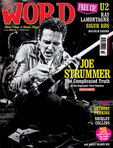
The last word
Being fired is unlikely to be an issue yet
at Word, the music title relaunched by David Hepworth
and Mark Ellen last year, because they launched the company (Press
Gazette feature). Their relaunch included adding the definitive
title to become The Word (when he became editor of the
Daily Telegraph, Max Hastings reinstated the 'Torygraph's'
original title as The Daily Telegraph). The magazine also
reshuffled its front sections with more reportage.
The Word relaunch was clearly a heartfelt one for David
Hepworth. A Guardian
article he wrote on design, with its emphasis on a magazine
being a thing designed to sell not occupy a frame on the wall, should
be required reading for everyone in magazine publishing. And newspapers
too for that matter. Many of the latter have gone far too far down
the same design road, resulting in similar products that look – and
in a process of function following form – become boring. They
no longer hold any surprises and lose their individuality. No wonder
readers are shifting to magazines and websites. The irony was that
Hepworth was writing in the Guardian on the day it unveiled
its big redesign. What happened to his columns, I wonder?
|
|