
Secrets of magazine cover design by Tony Quinn
1. The key ingredients
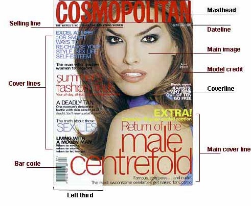
Magazine cover design diagram showing masthead, cover lines. (c) Tony Quinn
Brilliant magazine cover designs are the result of first learning what ideas work, and then adding a twist. But a design that works on a newspaper supplement, customer magazine or subscription magazine cover, might not work on the newsstand – where hundreds of magazines compete for attention. So, get to grips with the jargon and rules, and follow through to the other pages for inspiration, ideas and tips.
| Ingredients | Use on front cover |
| Masthead (title, logotype, logo or nameplate) | The name of the magazine displayed in a specific typeface. This is the visual branding of the title
and is often done in a specially designed typeface to be easily recognised and unique. The title or logotype – often these days called a masthead – is usually used on the contents page inside as well as the front cover, and as a logo for advertising and branding purposes. Titles for leading magazines are designed by specialised typographers such as Dave Farey and Richard Dawson (Good Food, Maxim and Design Week) and Matthew Carter (Private Eye).
Note that the Cosmopolitan title above overlays the cover image. This maintains the visual hierarchy of importance: masthead; anchor image; cover lines. There is an underlying grid structure controlling the position of all the elements. Some magazines will put the image on top of the title, as with the 1916 Bystander. Rarely these days, the title lettering will be split or the whole title moved to allow space for an image. On this cover, the masthead is prominent and consistent, but the red type is difficult to pick out against the model's hair. |
| Dateline | Month and year of publication, often with the price. Note that a monthly magazine usually hits the newsagents the month before the cover date. The essential elements are all there, but fade into the background |
| Main image | In the case of this front cover there is a single image of the American model Shana Zadrick. The image – sometimes called an 'anchor' – is used in a classic way; the face is big enough to stand out on the news-stand, with the model making full, direct eye-contact |
| Model credit | This says: 'Shana: So hot.' It is unusual for such a credit to appear on a magazine front cover, but it is done sometimes on fashion magazines such as Cosmo. The photographer and model credit is usually on the contents page |
| Cover lines | From the 1950s, greater competition on the newsstands resulted in more cover lines. Today, some magazines print special covers for subscribers' copies that use few cover lines. Cosmopolitan magazine uses a lot of cover lines, which are distributed around the main image without detracting from it too much. A mistake often made with cover lines is that they run over an image that has a lot of colour changes, rendering the words difficult to read. This is a problem here with the red text on the hair on the left and the smaller yellow text against Shana's skin. It is a busy cover but that shows there is a lot to read – and most buyers are readers, not just 'viewers' of pages and images |
| Main cover line | This is very large – taking up almost a quarter of the magazine cover – and comes in three layers, each with a different colour. It promotes the use of naked male centrefolds, a feature of Cosmopolitan in the UK since its first issue. Note the main cover line is placed against the model's shoulder so it shows up clearly |
| Left third | 
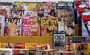
The left third of the cover is vital for sales in shops where the magazine is not shown full-frontage – as on these crammed shelves at a Zurich airport newsagent. The title must stand out among dozens of competitors. The start of the masthead is important here, as are short cover lines that are easy to read
The top fifth of the cover – usually dominated by the masthead – may be the key part in supermarkets or bookshops, where magazines are displayed differently |
| Bar code | Standard bar code used by retailers, displayed on UK magazines since 1988. Includes publication date and price. Postal-only subscriber covers can omit this |
| Selling line | Short, sharp description of the title's main marketing point (for Cosmopolitan: 'The world's No 1 magazine for young women') or perhaps setting out its editorial philosophy, such as FHM's 'funny, sexy, useful' |
| Covers evolve over time | They may be tweaked to exploit new printing techniques; switch from full face to a body shot; use illustration rather than photography; move the target readership age up or down; or simply to freshen things up. Take a look at four Girl covers for example; or three covers from Record Mirror. Compare the cover in the diagram at the top with Cosmo's first UK issue in 1972. What's changed and why? Pay attention to detail – does the cover image go in front of or behind the masthead? Why do you think Company's 2001 masthead is so similar to Cosmopolitan's? |
| Special covers | Many magazines try to stand out more when they launch, have an anniversary, want to promote a particular article, or have an advertiser who wants a split or gatefold cover. Tactics that have been used include metallic, fluorescent or other special inks, holograms, lenticular covers (which appear to move), embossing, scratch panels, and even diamond-like crystals. Some issues have come in plastic bags or cardboard boxes. And then there are cover gifts (which have the disadvantage of obscuring the cover) |
| Notable covers | The Magforum blog has a section on notable covers |
| More cover ideas |
|
| Legal issues |
There have been many legal cases brought by publishers accusing each other of copying designs. A frequent charge is that one title is trying to 'pass itself off' as another. Among the battles have been:
|
| (C) | This page is copyright. You cannot just copy it and republish it. If you want to use part of it or a summary, for example, on a website, in a project report, business presentation or for teaching material, you must credit the source and add a web link if online:
'The secrets of magazine cover design' by Tony Quinn Please contact me – tony [at] magforum.com if you need advice. Thanks! |
| Part 2: Magazine cover design – the right mix Part 3: Cover design – finishing touches Get to grips with the jargon |
|
| Other relevant pages: |
|