
The secrets of magazine cover design 2: The right mix
(Back to part 1)

|
|
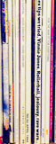
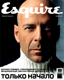
| Woman & Home was launched in South Africa into the competitive weekly women's sector. The cover has an even balance between words and image | Poster-style cover, with minimal encroachment on the celebrity image of Bruce Willis, for the launch of Esquire in Moscow. Compare the way eeach face has been positioned |
| Look and feel | The way a cover looks is dictated by its publishing and editorial strategy. The poster-style adopted by Esquire for its launch in Russia is laid back and confident – with the contrasting lighting giving a 'hard' feel to Die Hard actor Bruce Willis – compared with pastel tones for the first issue of Woman & Home in South Africa. Poster designs are chosen by magazines that feel confident they are not facing great competition on the news-stand. However, even the top magazines will only use this style occasionally. The men's monthly must use a face that is instantly recognisable, put the magazine in an international framework and appeal to well-off, aspirational readers. The photograph of Bruce Willis for Esquire will have been taken by one of the best photographers, it will be processed by the best repro houses and printed on very good paper by a very good printer – it will both look and feel glossy. Woman & Home is a mass-market weekly. Its female buyers will have a lot of options from which to choose. Also, Woman & Home will have to compete on newsagents' shelves where it will probably not be shown full-cover, but partly obscured by other titles. Esquire in Russia on the other hand will be sold in selected, upmarket outlets where it will usually be shown full-face on. |
|
| Cover lines |
Both covers above have a main cover line and subsidiary lines.
The Russian title keeps them out of the way at the bottom. Woman
& Home uses a range of techniques to make individual lines
stand out without overwhelming the others:
|
|
|
The image
See these Picture Post covers at Getty Images (a photo agency built on photographs from the magazine's publisher, Hulton) Study of US Life covers (Web Archive) Database of US covers |
Consumer magazine editors worry more about the cover more than
any other part of the magazine. It has long been a mantra that
an editor should 'prostitute himself' for the cover, because it
is so important to copy sales in the shops (particularly in the
UK where more than 90% of consumer magazine sales are in newsagents). |
|
|
Dick Stolley's mantra for
|
This mantra for cover images – and many variants of it – has been around since the early 1980s. It was coined by Dick Stolley, the founding managing editor of People magazine in the US in 1974. He has stressed that it was designed for People, which is regarded as having established the celebrity sector in the US. In a 1999 interview with the Peoria Journal Star, he added: "And after 1980 I amended the final line to 'And nothing is better than the celebrity dead'," following the death of John Lennon, "... which was the best-selling cover until Princess Diana on the occasion of her death became the best-selling news-stand cover." |
|
| Back to part 1 | On to part 3 | |
Other relevant pages:
|
||